
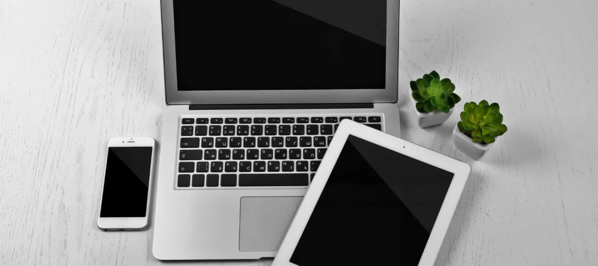
When it comes to web development, ensuring your website looks great on all devices—whether it’s a desktop, tablet, or smartphone—is crucial. This is where responsive web design (RWD) comes into play. By making your website responsive, you ensure it automatically adjusts its layout and content depending on the screen size of the device it’s being viewed on.
The backbone of responsive web design is media queries. In this article, we’ll break down what media queries are, why they’re important, and how to use them effectively to create a mobile-first website.
What is Responsive Web Design (RWD)?
Responsive web design is an approach that allows your website to adapt its layout and content to fit different screen sizes. In simpler terms, a responsive design ensures that a website looks just as good on a small mobile screen as it does on a large desktop monitor.
The goal is to make your website as user-friendly as possible, no matter what device people are using.
Why is Responsive Design Important?
- Better User Experience: A responsive website ensures that users have a consistent, easy-to-navigate experience across all devices. Whether they’re on a phone or tablet, they won’t need to zoom in or scroll horizontally to read content.
- Mobile-First Indexing: Google gives priority to mobile-friendly websites when indexing them, so having a responsive design can help your site rank better in search results.
- Cost-Effective: Instead of building separate websites for mobile, tablet, and desktop, you can use a single responsive design, which saves time and effort in maintenance.
Understanding Media Queries
Media queries are a powerful feature in CSS that allow you to apply different styles to a webpage based on the characteristics of the device it’s being viewed on, such as the screen width, height, resolution, and more.
In simple terms, media queries let you “ask” the browser: “Hey, is the screen width less than 600px? If yes, apply these styles.” If the condition is met, the specific styles inside the media query are applied.
Basic Syntax of a Media Query
The basic structure of a media query looks like this:
@media (condition) {
  /* CSS rules go here */
}
Here, the condition could be something like max-width or min-width, and the rules inside the media query will only be applied when that condition is true.
Mobile-First Design
Mobile-first design is an approach where you start by designing for mobile devices first, then use media queries to adjust the layout for larger screens. This approach is important because the majority of web traffic today comes from mobile devices.
For example, let’s say you start by creating a simple mobile layout and then expand on it using media queries for larger screens. Here’s how you would use media queries in a mobile-first approach:
Media Query Examples for Different Screen Sizes
1. Targeting Mobile Devices (up to 600px)
For mobile devices, we’ll set a max-width of 600px. This will target smartphones and small screens. For small devices, we might want to adjust the font size or layout to make it easier to navigate on a smaller screen.
@media (max-width: 600px) {
  body {
    font-size: 14px;
  }
  header {
    text-align: center;
  }
}
In this example:
- The font size is reduced to 14px to fit smaller screens.
- The header text is centered for better alignment on mobile devices.
2. Targeting Tablets (600px to 900px)
For tablets, we usually work with a min-width of 600px and a max-width of 900px. This range will target devices like iPads and Android tablets.
@media (min-width: 600px) and (max-width: 900px) {
  body {
    font-size: 16px;
  }
  header {
    text-align: left;
  }
}
Here:
- The font size is increased to 16px for tablets.
- The header text is aligned to the left for better readability on larger screens.
3. Targeting Desktops (900px and above)
For desktops, we typically use a min-width of 900px or higher. This targets large screens like laptops and desktops.
@media (min-width: 900px) {
  body {
    font-size: 18px;
  }
  header {
    text-align: left;
    margin-left: 20px;
  }
  .container {
    max-width: 1200px;
    margin: 0 auto;
  }
}
In this example:
- The font size is set to 18px for larger screens.
- The header text is aligned left with some margin for better spacing.
- The container has a max-width of 1200px to limit the width of the content on large screens.
4. Targeting High-Resolution Screens (Retina Displays)
For high-resolution screens (like Retina displays on Macs or iPhones), you can use the min-resolution or min-device-pixel-ratio query to make images and text sharper.
@media (min-resolution: 2dppx) {
  img {
    width: 100%;
    height: auto;
  }
}
This targets devices with high pixel densities and ensures images scale properly for these screens, providing a crisp, clear appearance.
More Types of Media Queries
1. Orientation
You can target whether the device is in portrait or landscape mode. This is particularly useful for ensuring your website looks great on devices that can be rotated.
@media (orientation: landscape) {
  body {
    background-color: #f0f0f0;
  }
}
This will apply the specified styles when the device is in landscape mode.
2. Aspect Ratio
You can also target devices based on their aspect ratio (the width-to-height ratio).
@media (aspect-ratio: 16/9) {
  body {
    background-color: #333;
  }
}
This targets devices with a 16:9 aspect ratio, like most widescreen monitors.
3. Color Scheme (Dark Mode)
With the increasing popularity of dark mode, it’s important to account for users who prefer a darker interface. You can use the prefers-color-scheme media feature to apply different styles based on the user’s theme preference.
@media (prefers-color-scheme: dark) {
  body {
    background-color: #121212;
    color: #ffffff;
  }
}
This will apply dark mode styles if the user has set their device to dark mode.
Conclusion
Media queries are the heart of creating responsive websites. By using media queries, you can design a website that adapts to various devices and screen sizes, providing a seamless user experience. Whether you’re targeting mobile devices, tablets, or desktops, media queries allow you to adjust styles based on the specific needs of the device.
By embracing a mobile-first approach and using media queries effectively, you’ll be able to ensure your website looks great on any screen, boosting both user satisfaction and your site’s performance.
Happy coding!
Leave A Comment